Fire extinguisher, are you fire code compliant?
Fire Extinguisher is a company that sells fire code compliance products and provides services to identify whether your commercial or residential property is fire code compliant.
Fire Extinguisher operates a successful company and has an existing customer base. In order to expand their brand and reach new customers, they want to redesign their website and create an online quote process that will provide their users with a better experience than their current quote by phone or physical visit.
In our initial meeting with the client, we identified that they are open to a complete brand redesign, and want to avoid having company look like an american flag, which is common in their industry given the color of the products.
THE CHALLENGE
REVIEWING UX DELIVERABLES
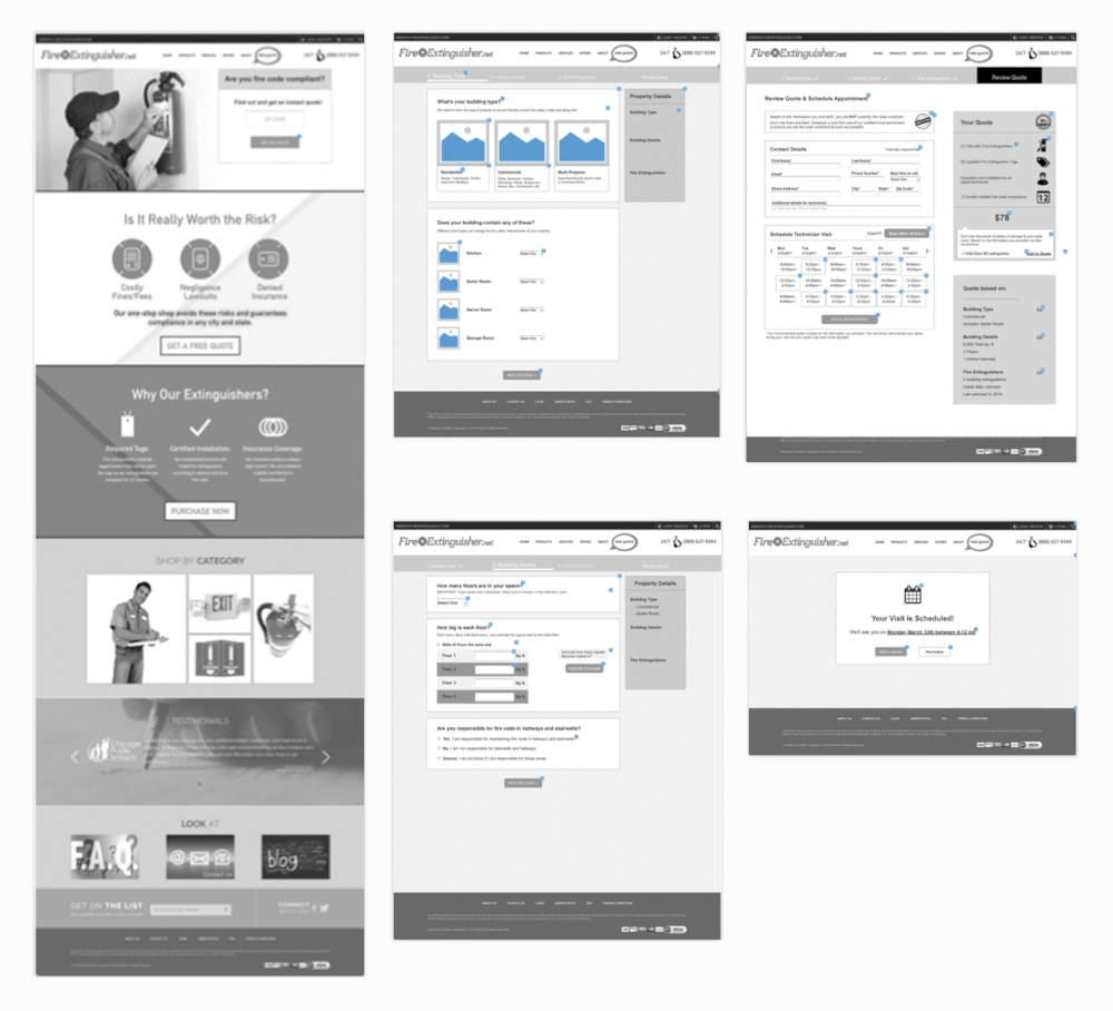
Our team worked with a group of UX designers who had already been engaged with Fire Extinguisher to create user personas and low fidelity wireframes for the site homepage and quote process. Our goal was to improve the wireframes and bring them to life considering the customer while creating a new identity for the company.
There were two primary users for Fire Extinguisher. Through interviews with the client we learned a bit about each and their unique needs:
Property Managers are experienced with fire code compliance and have an idea about what they need and how the pricing works. For this user, the quote process needs to be fast and efficient, so they can get to what they are looking for which is is pricing.
Small Business Owners / Tenants are less experienced and likely have never thought about fire code compliance, what they need, or how much it is going to cost. For this user, the quote process needs to be easy to understand and provide enough guidance and visual direction to gather the correct information and give them an accurate, digestible quote.
RESEARCH
Studying the Competition
My team researched what's on the market and how they applied design for their target user. This helped us to understand what's working and what we should avoid.
Here are the takeaways we learn from the competition:
Things to emulate
Use both photography and graphics to balance the professionalism with relatability
Well-balanced display of content so that products and services are not buried in other pages
Use negative space to space out information and keep the layout clean
Bold/heavy typography
These websites gave us inspiration behind what to emulate Western States Fire Protection Co. Skynet security Colley Elevator Co.
Things to avoid
Overuse of red as the primary color can cause cognitive overload
Oversaturation of information with too much text
Too many bright colors/color gradients
Here are some website that are references of what to not do Fredriksen Fire
Getting Inspired
Design Principles
The first step for our team before putting pen to paper was to set our design principles that can guide the rest of the project. We used what we learned from the UX team, our competitive research, and initial conversations with the client to define our design principles:
With us, you’re in control
We build confidence in users through well-known design patterns to keep them coming back.
Don’t worry, we’ve got you
We display content using clear and concise sentences while incorporating photography for added clarity.
We’ll make it a walk in the park
We delight you with our simple forms and fun interactions while also keeping a consistent tone of professionalism.
style tiles
In order to give our client a variety of options our team split to work individually on our designs. Creating style tiles was the first chance for me to put my ideas together. For this project I had a lot of inspiration to work with so it was easy for me to create three distinct styles.
For this style I focused on keeping it clean, balanced and inviting. Through the use of illustrations I wanted to provide a simple understanding of the products and services in order to guide the customer through the process so they don't feel overwhelmed. I used blue to represent professionalism, and minimized the use of red to tell users what's the next step or more important elements. I also wanted a good use of white space.
With this style tile I wanted to be more contemporary, energetic, and direct compared to what is already on the market. I accomplished this by using more sharp edges and a darker mood.
I decided to contrast the two main colors to give a more dramatic and energetic feel. I used blue for section headers, CTA highlights the to guide the user's eye to where he needs to be.
The red color will be shown only in photographs. Bold typography adds to the dramatic feel and keeps the users focused on what's important.
This style is simple and brand centric through its use of red. I chose these colors to stay on brand but balanced the use or red to not overwhelming the user. I focused on creating a simple navigation and data entry through the use of cards and selection options (rather than drop down lists) to simplify data entry. For typography I kept it simple, using caps to give hierarchy and appropriate attention when needed.
After presenting my styles to the client he made it clear that he wanted the design to have red or orange to stay on brand, and avoid the use of illustrations. The client was happy with my designs overall, but chose the this one as it kept closer to the branding he was looking for.
Giving Fire extinguisher Style
Now that the style was chosen I selected a few key screens from the UX wireframes to apply the new design elements to. As I mentioned before the client really liked the selection option instead of the drop downs, so in cases like this I modified the wireframes.
This was a really fast project so I needed to have user testing before the client saw the screens. Through the first round of user testing they liked the use of red as it related to the theme “fire”, and they liked how easy was the process was. One area of concern from the users was that the section review quote had too much information. I took the feedback from users and presented them to the client. I already had some ideas on how I could improve the design for the next iteration.
This was the next version that I tested with users, but they generally had the same reaction as the first time around. They liked the red because it represented the brand. They felt that maybe it was confusing having the cta in grey, and they wanted a little more color overall throughout the design. Also in the review quote section they felt was still too much information and they feel overwhelmed completing it. I took this feedback from users and applied changes before our next client presentation, where I reviewed with him the feedback and why I made certain changes.
I applied blue on the next section and leaving the red cta for primary actions, also in the footer I make it more interesting adding a photo.
Color drives the website’s appeal to users
Traditional colors of blue, white, and red keep the site clean, cohesive, and professional
A visual layout that is spacious keeps user interest
Users like having forms separated into compact cards broken up into pages for flow and breathability
Visual aids (primarily photography) aid in content clarity and engagement
Users are able to easily enter data based off photos that directly relate to the text
Bringing it to Life
This was the last version of the design, and I had one more chance to do user testing. After the comments from the previous design I knew I needed to simplify the screens and make it look less cluttered and overwhelming.
I realized the red color within certain elements was causing it to look like there were errors on the screen and make it look more busy, so I decided to change it to orange which is still on brand (fire), but more friendly. I added in blue to create more visual interest and make the website look more trustworthy. In order to simplify the review your quote screen I created pop-up screens where the user could enter more information in a step-by-step process rather than having everything on one screen.
Another change was on the logo ”fireextingusher.net” the users felt really confused why the logo had “.net” in the name, which made it feel old. With the permission of the client I remove the “.net” and applied the new colors being used throughout the whole design to match the style.
Here's a list of the main changes I made for the final design:
Blue for navigation and icons to keep it professional
Changed red to orange, users felt more comfortable with orange
Orange for CTA and subtle accents express the brand
Logo was modified, deleted the “.net” which confused the user, and the colors were changed to the colors that I’m using on the whole website for more consistency
“Free quote” was deleted from the main menu after last presentation feedback
Deleted the box to get your quote for a more clean design
Put in additional screens for contact details and schedule visit to not overwhelm the user
After completing the website redesign I created a mobile responsive version of the website. Some key highlights from the mobile design:
● Responsive design helps optimize the layout on mobile
● Main navigation will be represented in a hamburger menu
● Shopping Cart and Phone will be always visible
● Different layout, same information
● Different treatment of the “Schedule visit” from the desktop
After receiving approval on the design of the client I worked on the style guide, which will help the developers and future designers to implements any changes they need.
Conclusion
We ended up creating our style tiles without first creating moodboards. We collected a lot of images from various existing websites. I preferred doing that, because it saved a lot of time. That helped make my design process more efficient.
This was the first time I worked on a desktop website project, so I was able to work with grids. In the beginning, I didn’t use them, and it created some difficulty with my screens. I was able to better organize my screens and the InVision prototype came out much stronger.
I enjoyed this project because, since the beginning, I worked really well with my team. The three of us were on the same page throughout. The client had an idea for a concept at the beginning, and after our user testing, we discovered that users needed a different concept. Our team’s designs were different, but we were able to make changes really easily.


