CHECK IN, KEEPING YOUR STUDENTS ON THE RIGHT TRACK
Teenagers can be a handful. Educators do their best to ensure each student is getting the appropriate attention to be successful, but without the support of parents providing the right guidance at home, it can be very challenging.
Check In was created to be a platform that allows teachers and parents to collaborate, ensuring that each student is getting the support they need to be successful. It was created through a series of design sprints that lasted 4 weeks. As part of a 3 person UI design team for DESIGNATION, I was tasked with developing a style and identity for Check In, and bringing it to life by building high fidelity prototypes of the web app, mobile app, and marketing website. I experienced emotional highs and lows throughout this process, but by the end I felt accomplished with what we created.
THE CHALLENGE
REVIEWING UX DELIVERABLES
Our team worked with a team of UX designers to transition their wireframes to the final product. We received all of their deliverables including interviews, user personas and low fidelity wireframes. We had time to analyze the work and ask questions of the UX designers.
Why was the navigation designed the way it was?
What parts of the layout and design were the customer passionate about?
Why are certain elements given more importance than others?
It's always a bit challenging to understand how set the design team and client are in the UX wireframes, and where there is room to improve or adjust the design to better serve users.
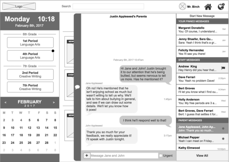
Through our discussions with the UX team and their user interviews we learned that messaging was very important for the teachers to maintain communication with parents, and that the messages needed to be easy to access and navigate. Also, that the schedule was key for teachers to navigate to their different classes, but didn't serve much functionality other than that.
Additionally, the UX team asked us to help rebrand the platform, which they were calling “Briteline”. The client was not passionate at this point about that name, so we were able to be creative with the logo and branding. Thats where the name “Check In” comes along. Later on, I’ll outline how I came up with it.
The UX team identified two user personas for Check In.
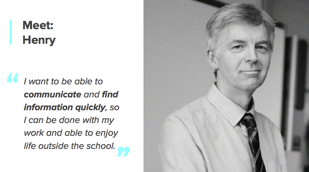
Let’s meet Henry first. Henry was an older, traditional teacher. He just wanted to get things done quickly so he can be done with work on time and enjoy his life outside the school. When I thought about designing for Henry it was all about ease and simplicity. The apps should direct the eye to what's most important to get the work done, and leave out any unnecessary clutter. Henry wasn't necessarily tech savvy or accustomed to learning new technology platforms, so it needed to be organized in a way that was easy to understand.
Once I knew Henry was the persona I was designing for I had some immediate concerns about the UX team's layouts. The navigation for the web app was pretty inconsistent. Key elements were hidden behind icons and things popping out from every which way. The changes I made to the layouts are detailed later in case study.
Now let's meet Sung-min, the immigrant father. Sung-min wanted to meet other parents and have a stronger support network. He didn’t feel involved and sometimes struggled keeping up with all the communications from school. He had a time consuming job running a corner store, and his weak command of English made keeping up with all the communications a challenge.
I felt good about what the UX team had created for Sung-min. The mobile app, which is for parents, has a lot of features like messaging that will allow him to stay connected with other parents. There's also a news feed that will keep him up to date with what's going on at the school. I knew when I created the visual designs I needed to have elements that made it easy for Sung-min to understand despite his weak command of English.
research
Studying the Competition
At this point our team worked together to understand the competitors and discover what was and wasn’t working for them. Here are some example of what's on the market.
First we have the more friendly/childish designs, Remind and Classdojo, which are good examples because they are simple and clean. They both have a good use of typography and visual hierarchy. They use different icons and colors for each section that help their user understand and navigate the apps.
These two examples are more serious and geared towards adults.
Appletree has a very clean interface, they use cards to create structure and separation on each page. The colors are intense but well used, and the hierarchy is consistent.
Rate my teacher has excessive ad space which takes the focus away from content. The logo and header colors are inconsistent, navigation styles are inconsistent, and they use too many links on one page. The overall aesthetic appears outdated.
By reviewing the competitors we found that none of them quite fit what we were aiming for, but we could take the positive elements as reference and apply them to our design. We wanted something that was simple and clean like Class Dojo and Remind, but more geared towards adults like Appletree.
Getting Inspired
Design Principles
To start the design process, we set a few design principles that would guide the rest of the project. Based on what I learned from our UX team and through reviewing the competitors I defined the design principles to be:
“Walk in your shoes” Thinking like the user, what do they need and what actions are they going to take.
“Be consistent” Direct users to important issues, provide more details only when necessary.
“Easy to find” From the first time the user uses the app they need to feel like they were there before. Make the user feel comfortable, not frustrated.
Setting the design principles at this point in the process was important to keep our team grounded once we got into actually designing. It’s easy to get carried away with colors, typography, photography etc. and become passionate about what you are creating. Having these design principles to reflect back on kept our team in check and made sure we were always making design choices with the right principles in mind.
Moodboards and style tiles
At this point our team split up to work individually on some divergent styles to give our customer a variety of options. I started by finding inspiration on different websites and platforms, followed by creating three different mood boards to see how elements could work together. This part was fun for me because I got the chance to explore different directions. After creating 3 moodboards I translated each into a style tile. This was a bit challenging because I had the idea in my head but had some difficulty getting it to come out that way in reality.
Graceful, Professional, Modern
In this style I wanted to show a more modern and professional look. I wanted the parent and teachers to feel that the communication between each other was important. I decided not to go with this style because after showing it to the client they felt it was more feminine looking and they wanted the app to be for all genders.
Friendly, Happy, Playful
In this style I was searching for something more playful and friendly, a style that looked younger but made the parents feel involved in the student's life. With this style the client felt that the use of color was a little too harsh and it gave the idea that the app is for a younger age range.
Powerful, Dynamic, Extroverted
I chose this moodboard and style tile because it best represented what the client wanted for the app. The softer shapes contributed to the friendliness of the app and made users feel more comfortable interacting with it. I also wanted them to feel dynamic and energetic, which is accomplished through the colors. This style best matched the target age range and also gave a fresh but powerful mood for the parents and teachers.
Creating an Identity
Sketching ideas
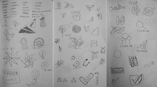
Now that I chose the style I wanted to work with, it was time to create a name and a logo. I started by creating sketches and at the same time thinking of names. This part of the project was fun but challenging. Fun because I had the chance to create something unique and new, the client was open to recommendations to completely change the name and logo. Challenging because when I was coming up with ideas I kept falling in love with certain concepts, which kept getting me stuck.
Creating the identity (logo and name)
After working through many sketches and ideas I chose Check In as shown below. This logo best represents the app by incorporating elements from the home as well as school. As you can see, the icon is the roof of a house combined with a check representing the grades or marks a student is given at school. This logo emphasizes that the home and the school need to work together to make sure a student is successful. Also the name of the app, “Check In”, uses a play on words of the check within the logo design itself, and the idea that the parents should have the ability to always know how the student is doing in school. As you can see in the sketches above, this design came about through a number of ideas and iterations. I had the idea of the house and the name hover (which sounded a bit clingy), and the check with the name check up (which sounded like a doctor's visit). I brought these ideas together in an aha moment to arrive at my final design.
Giving Check In Style
Improving the user experience
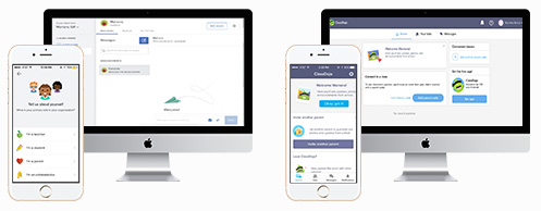
As I began to move into designing the wireframes, it became clear that there were some fundamental issues with the design of the web homepage. The site navigation was inconsistent and confusing for the users we tested. This directly contradicted the design principles we were following. I created a left navigation bar where search, messages, notifications, and home could all be easily accessible. This allowed me to reconfigure the main home page content, giving more emphasis to the calendar and teacher schedule. This represents the user-centered design approach our team used, as the research the UX team had completed revealed that the schedule was one of the most important tools for navigating the site.
UX Wireframes
BuildING key screens in low to mid fidelity
In order to validate my style and test it with the client I built out some of the key screens in mid-fidelity. This allowed me to apply the key design elements and see what the final product would look like.This step was helpful to identify any design elements that may not work as intended and need to be adjusted. During this step I iterated on the new navigation layout a couple of times with the client until I had it right.
Bringing it to Life
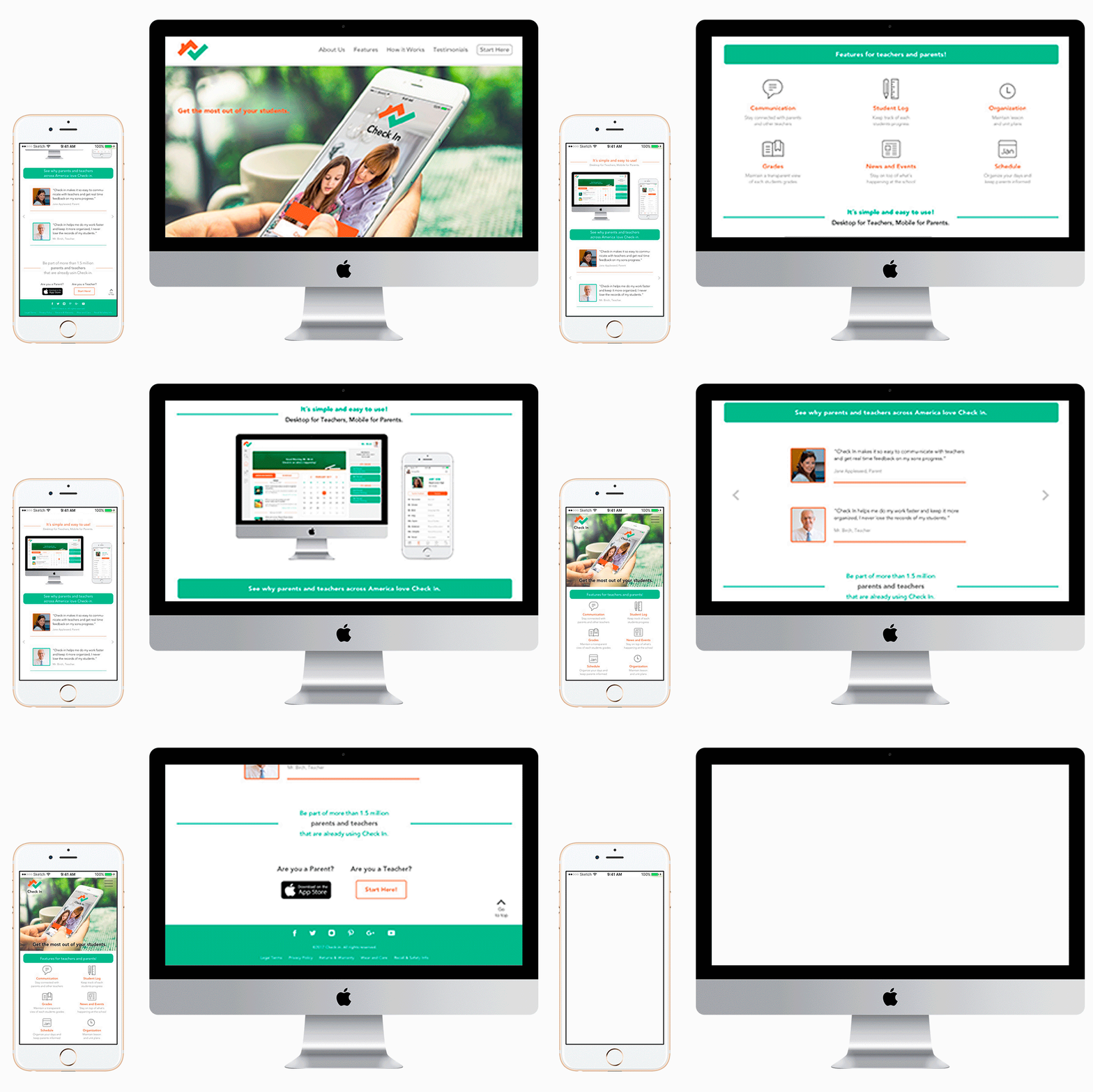
After I applied the style to all screens I created a prototype for Mobile and Desktop. Additionally, I created a marketing site to promote the app and show potential users the features of the platform and the benefits and can provide. I focused the marketing site to communicate the features towards teachers, given that the platform needed to be first adopted by the schools. It will be their faculty and administrators that drive the move towards this new technology.
Conclusion
Check In is a strong platform, but I would like to see it expand its scale and features in the future. It would be great if there was a view for students that could monitor their own grades and progress throughout the year. Also, the current product is targeted specifically at middle school students. Having one consistent platform that stays with a student from primary school through high school would be beneficial. This way, their performance history could be maintained and additional insights could be provided.
Working through this iterative design process was a great learning experience, and was not without its challenges. Working with a UX team that I had no prior working relationship with made interpreting the wireframes and intent of the design difficult. Through multiple discussions with the team and my own user interviews, I was able to identify opportunities to improve the UX layout. Understanding the boundaries around what I could change or what the client was already “sold” on was tricky, but this project gave me confidence to approach these situations head on and feel comfortable recommending improvements for the client.
Working in a team was beneficial for the client and definitely allowed us to produce a better product. Our team played off one another's strengths well and we were able to help each other through the process. I, for example, was a bit timid in presenting our work in the beginning as English is my second language. My team helped put some structure to the presentation and let me speak to sections I knew best. As I improved throughout the project I took on more speaking roles and my confidence grew each time. I quickly realized that it was all in my head. Getting positive feedback on my presentation from the client was one of the most rewarding moments for me.
After completing this project I took the lessons learned and applied it to my future work, which allowed me to complete them faster and with greater confidence. You can see the case studies using the links below.


